
SpaceX Rebrand
I very much admire SpaceX and their wondrous achievements, led by Elon Musk's amazing vision and drive.
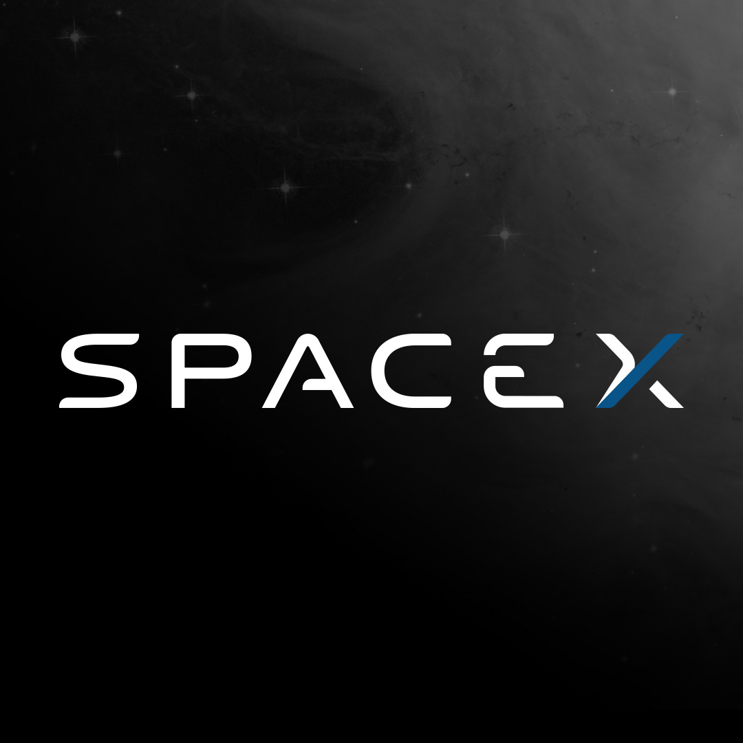
And while I enjoy the current SpaceX corporate branding with it's cyber-futuristic 'Blade Runner' looks (it's unique looks lending itself well to an equally unique company), I've always wondered how I would approach a rebrand of the company as a design challenge. (and as a fan, a way to creatively explore and express my admiration through my main skill-set)
Something that builds on the legacy of the current brand, but extends it to encompass & symbolize SpaceX's push past LEO (Low Earth Orbit) and out into the solar system with the upcoming Starship. It should also represent the way SpaceX has humanized space flight with it's new minimal & elegant design approach to interiors & systems, space suits, etc., a vast departure from current space tech. Basically a way to best encapsulate and symbolize the next phase of SpaceX's mission.
Below I explore my proposed SpaceX rebrand:
Design Rationale
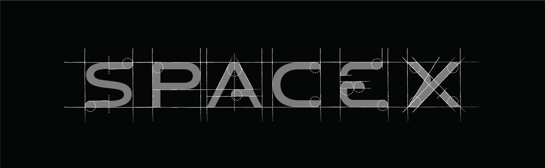
My proposed logo design follows a similar form to the original, utilizing a mono-space font layout. While still making use of a San-serif font, it has a more humanist touch rather than the harsher mechanical straight lines of the original. It also has a larger cap-height than the original, but a slightly lighter font-weight to offset this.
The 'A', 'E' and 'X' received the largest changes, addressing certain current-version downsides of each.
The current 'A', with it's omission of the left stroke creates issues with regards to kerning & visual dissonance. Although adding a touch of futurism, I felt the omitted stroke was a little too distracting and unbalancing so I chose to introduce it back in. To bring back some of the character, I cut the crossbar short and rounded off the edge to the same degree as the other main terminals. This rounding is a theme throughout the character set, and creates a sense of a coherence.
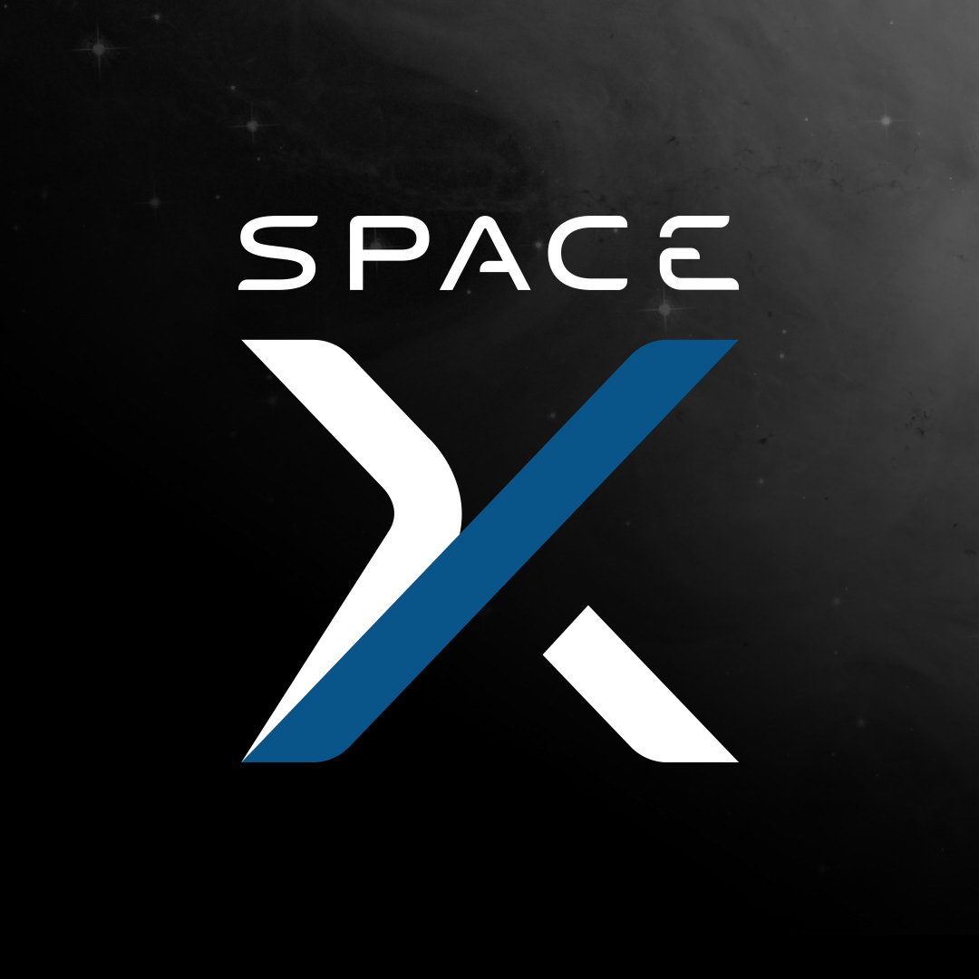
Proposed design - Primary Logo Breakdown
Proposed design - Primary Logo
The current 'E' with it's closely spaced top and middle arms I feel draws too much focus because of it's relatively heavy visual weight. I kept the grouping of the middle and bottom arms to keep it's association with the original, but spaced the middle arm closer to the actual center of the cap-height. I also made use of the rounded terminals in an opposing manner to the adjacent 'C' to create a quick visual differentiator between the both and help with the flow of the letters.
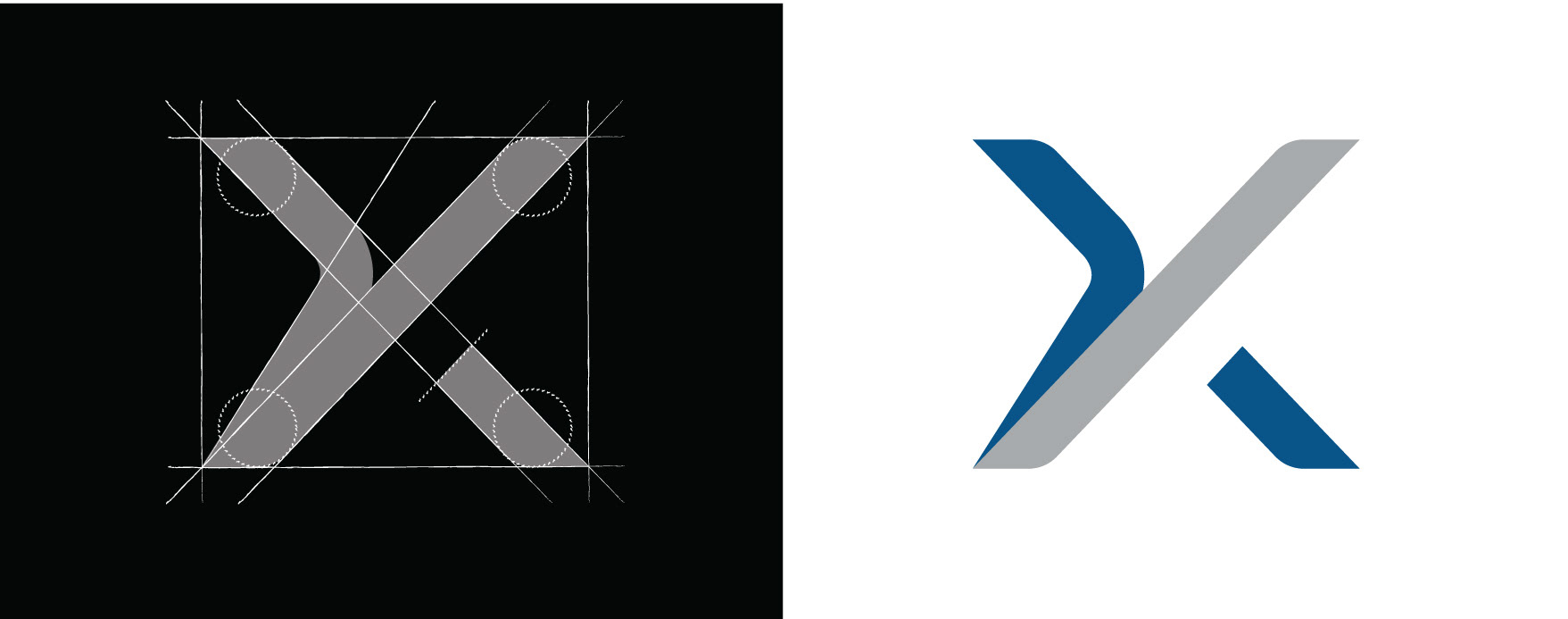
Proposed design - 'X' Mark
Undoubtedly, the crux of the branding sits with the execution of the 'X' mark. The original is representative of the path a rocket takes after launch, while also creating a unique visual identifier symbol for the brand. While being unique and representative of a real launch, the 'X's long trailing stroke can also be problematic in an otherwise fixed-width font. It requires around double the character width of the other characters, which in some implementations leads to an overall decrease in the logo size to accommodate it. Even when used in isolation, the current 'X' can be challenging to place.
My proposed design tackles this issue by keeping it within the limits of the character widths, which makes it easier to use in isolation or as part of a horizontal or vertical full logo.
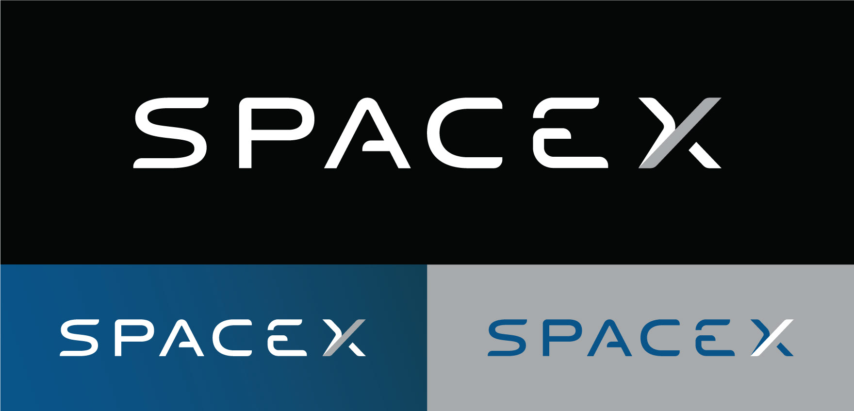
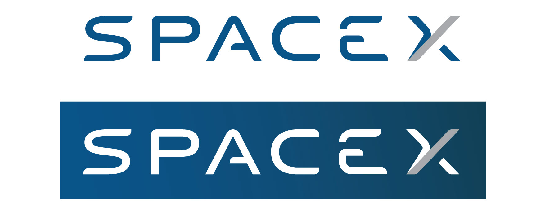
Proposed design - Primary Logo Color Variations
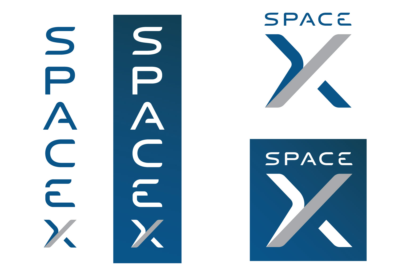
Proposed design - Primary Logo (Vertical) / Secondary Logo
It also enables the creation of a secondary logo to be used when the space available is insufficient for the full horizontal/vertical logo. The proposed 'X' builds upon the current form, using the grey stroke to represent the second part of SpaceX's journey (out into the solar system from LEO). The form created by this symbolism creates a unique and memorable visual device which can function in isolation, as well as in a horizontal or vertical lock-up with the other letters of the logo.
The frame of reference inferred from the current logo's 'X' is standing on the Earth. As this proposed design emphasizes the next step in SpaceX's journey, the frame of reference is changed to infer an outer-space-based vantage point.
The small bottom stroke separate from the main form represents the unknown, the next step in the journey not yet visible but just below the horizon to come.
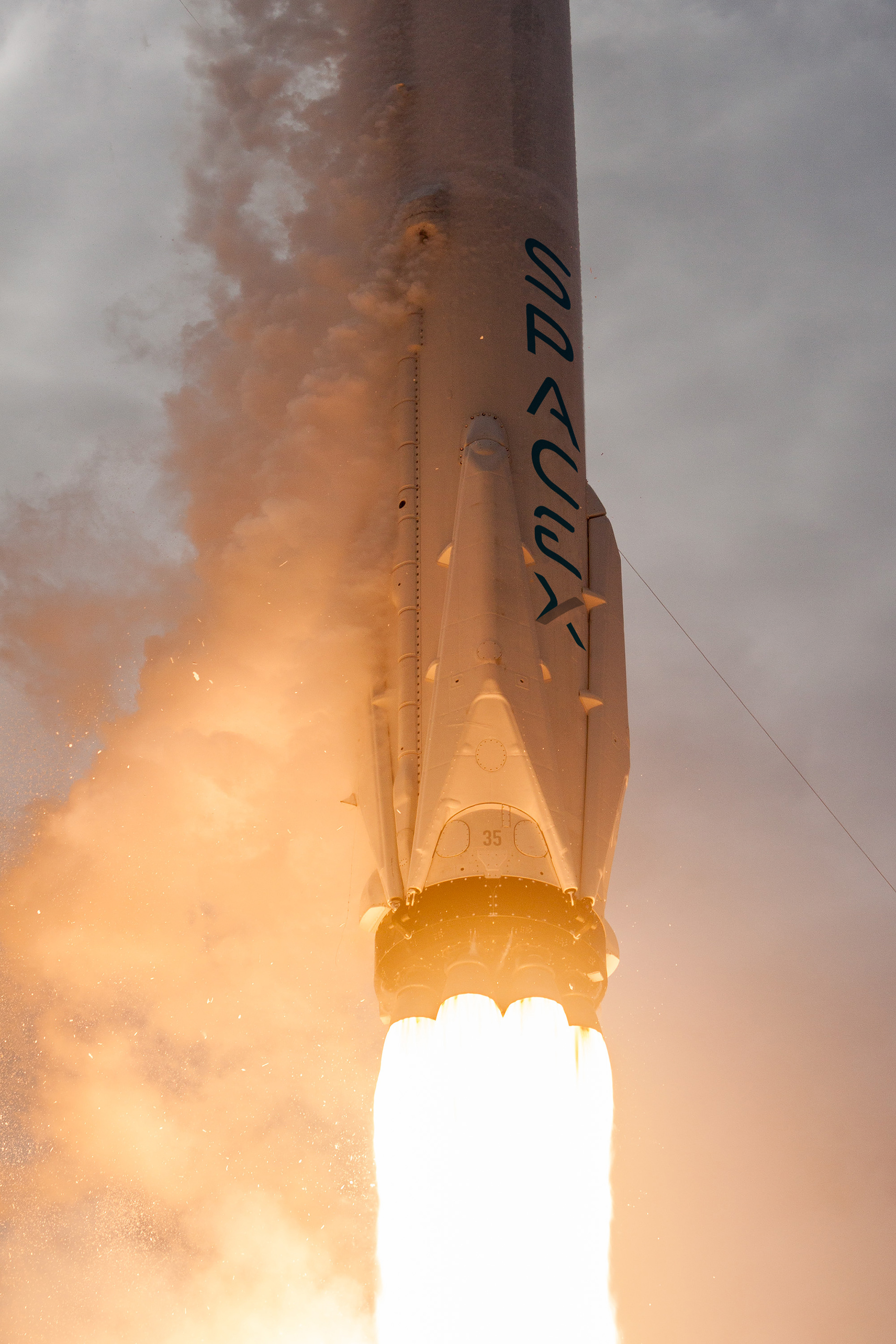
ABOVE: Proposed design - Vertical Logo Falcon 9 Mock-up
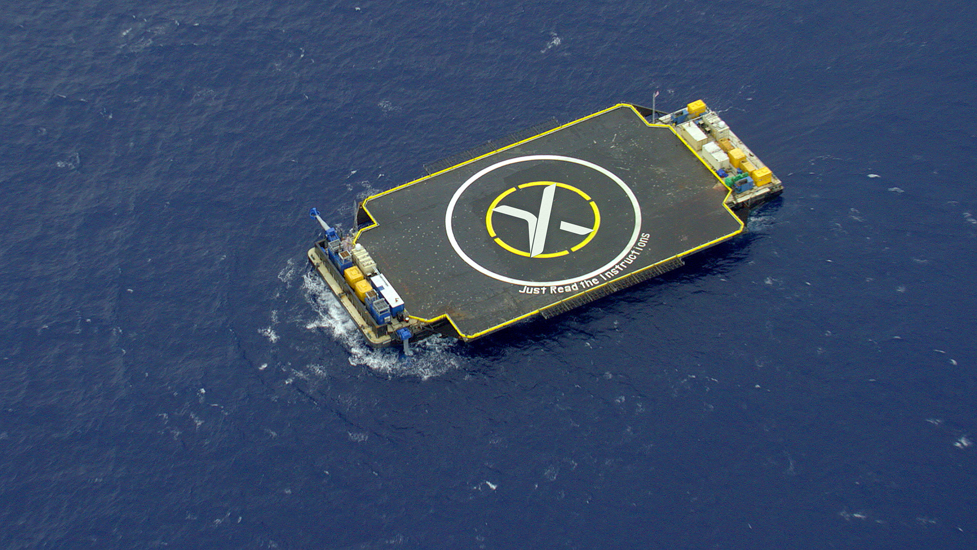
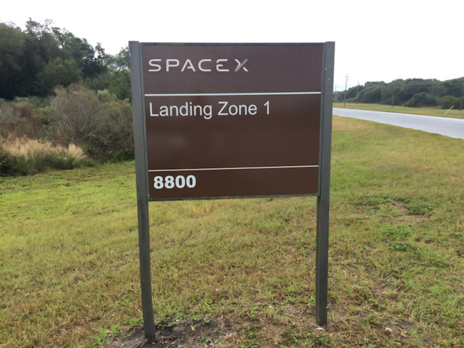
BELOW: Proposed design - Drone Port Ship & Landing Zone 1 Sign Mock-up
Thank you.
#OccupyMars
#OccupyMars
PLEASE NOTE:
All SpaceX images used are public domain, sourced from the official SpaceX Flickr page (https://www.flickr.com/photos/spacex/).
This is a not-for-profit personal design project only. The SpaceX name, logo or other trademarks are sole property of SpaceX.
All SpaceX images used are public domain, sourced from the official SpaceX Flickr page (https://www.flickr.com/photos/spacex/).
This is a not-for-profit personal design project only. The SpaceX name, logo or other trademarks are sole property of SpaceX.