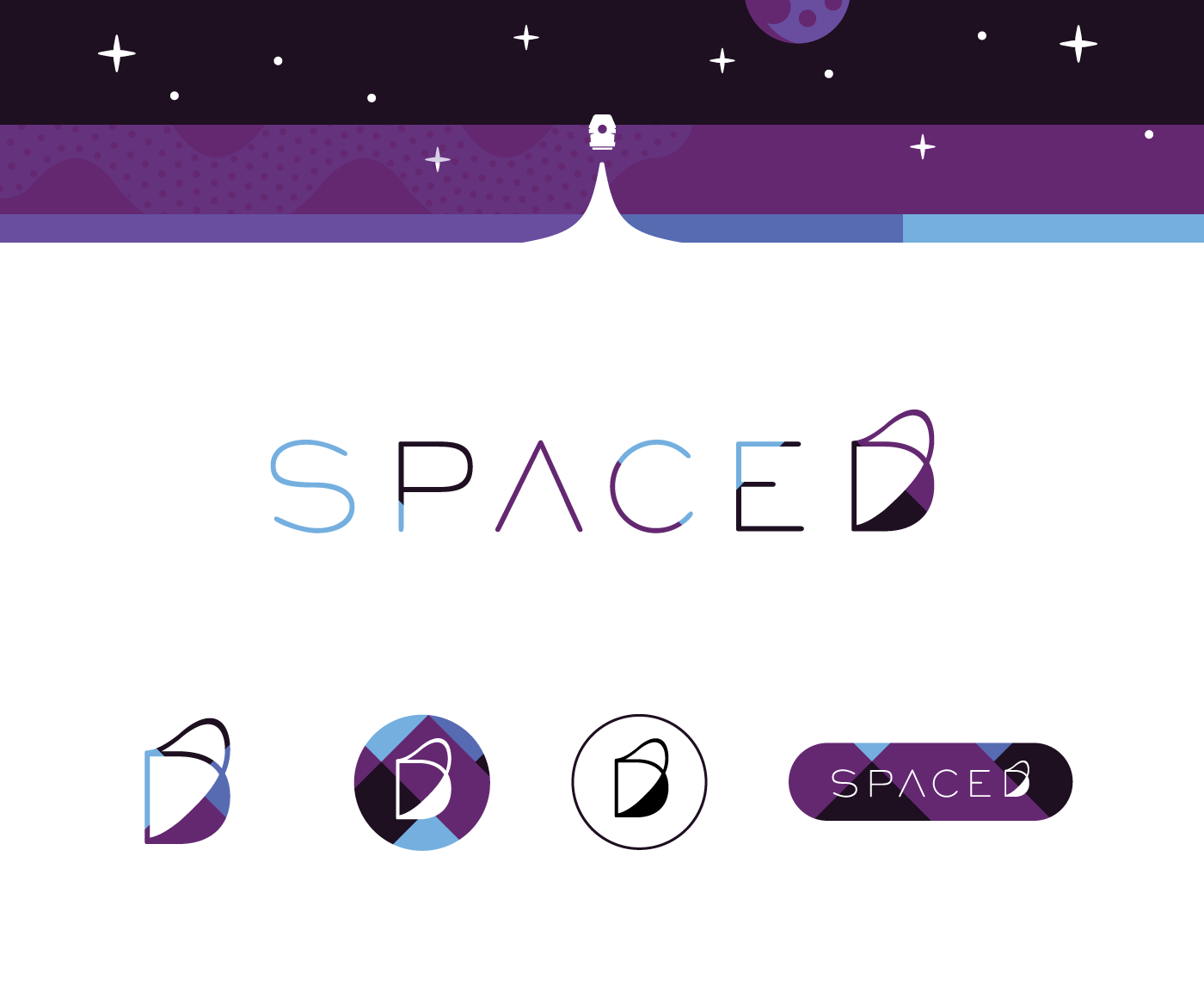
My branding entry for the #SPACEDchallenge
Concept:
"A window to the universe" / "Peel back the known to discover something amazing"
"A window to the universe" / "Peel back the known to discover something amazing"
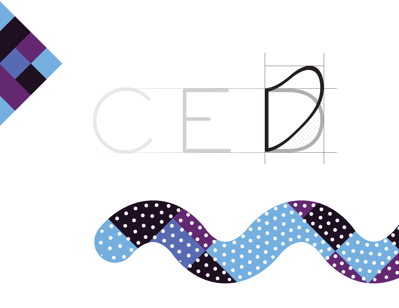
Making use of a colour palette representing the ascent into space, combined with a thin weight san-serif font to create an unobtrusive yet nuanced brand logo. The simplified A without crossbar gives a hint of futuristic flavour, but the focus being firmly drawn by the stylized 'peeled back' D, giving a sense of wonder and creating a point of visual difference.
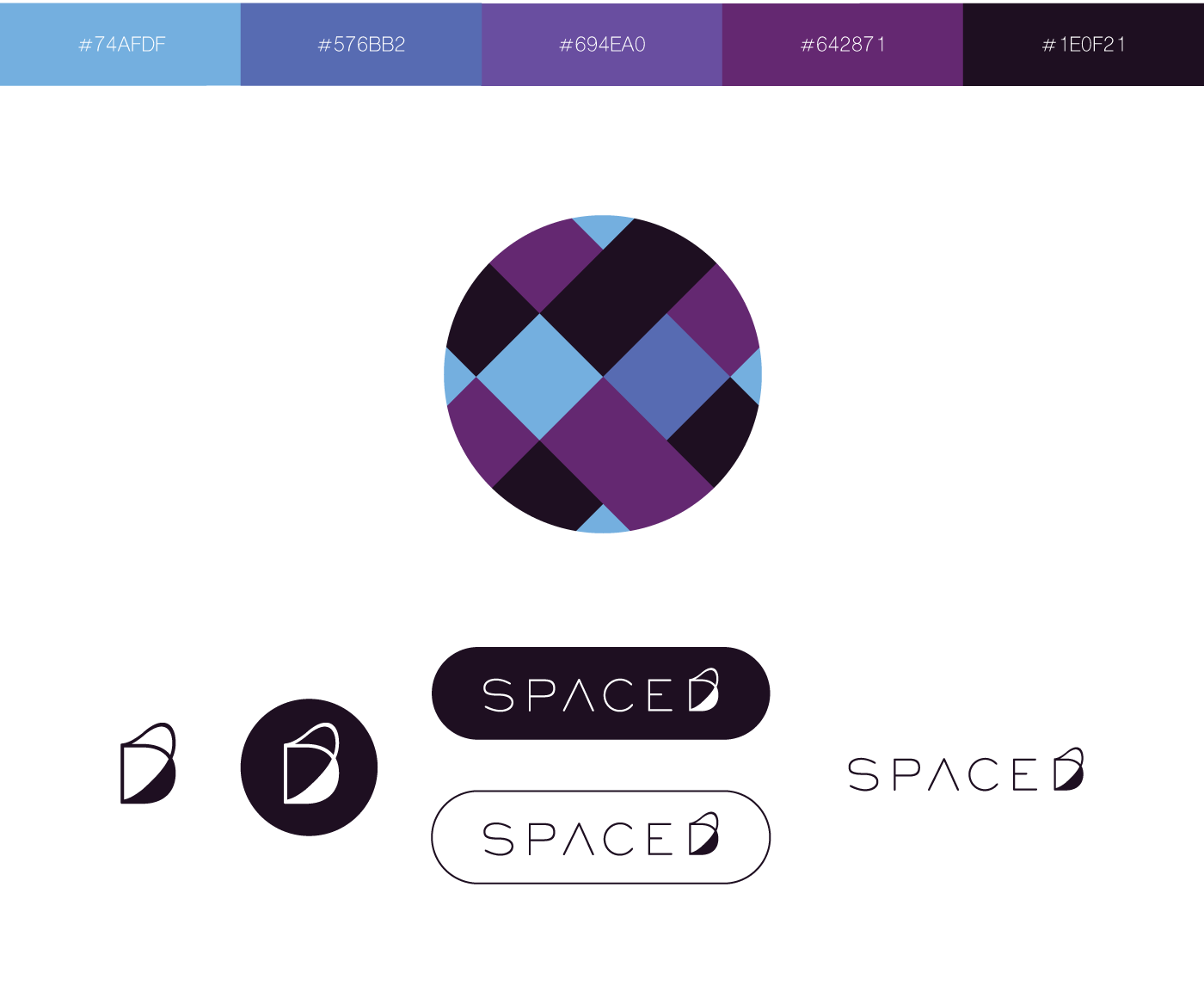
Rather than a simple gradient, the colour palette has been applied in a patterned fashion, creating strong geometric lines within the various logo versions. Designed to be flexible & recognisable even with the most simplified application, and without the use of overt symbols. (rocket, flame, etc.)