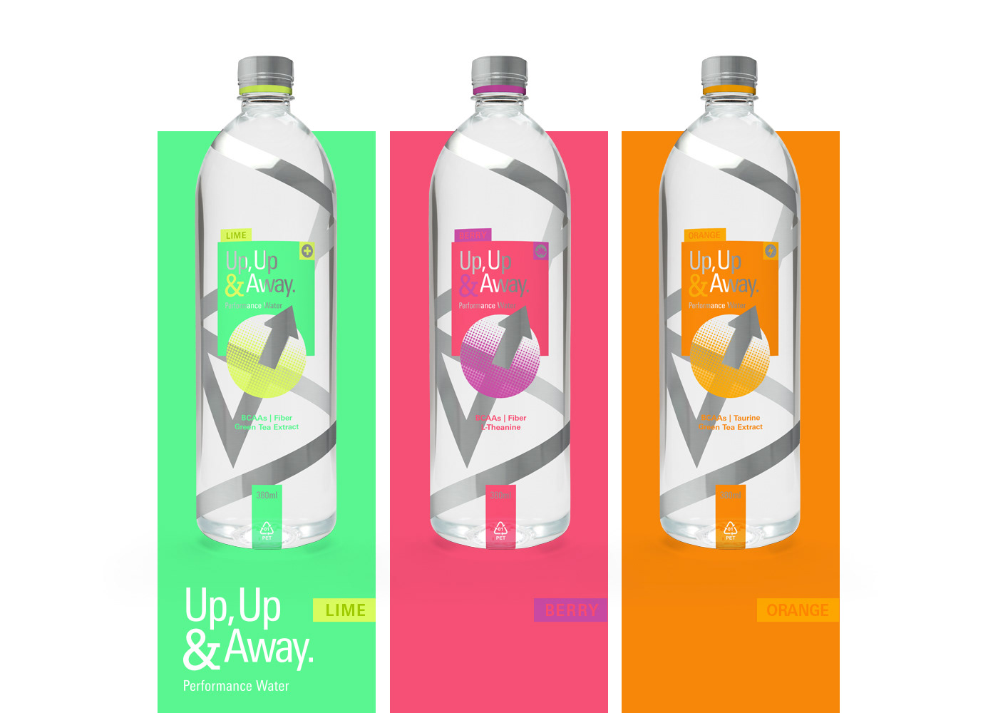
This concept design, submitted as part of the Dieline CWWWR Awards 2015, is a performance water product targeted at the premium bottled enriched water market segment.
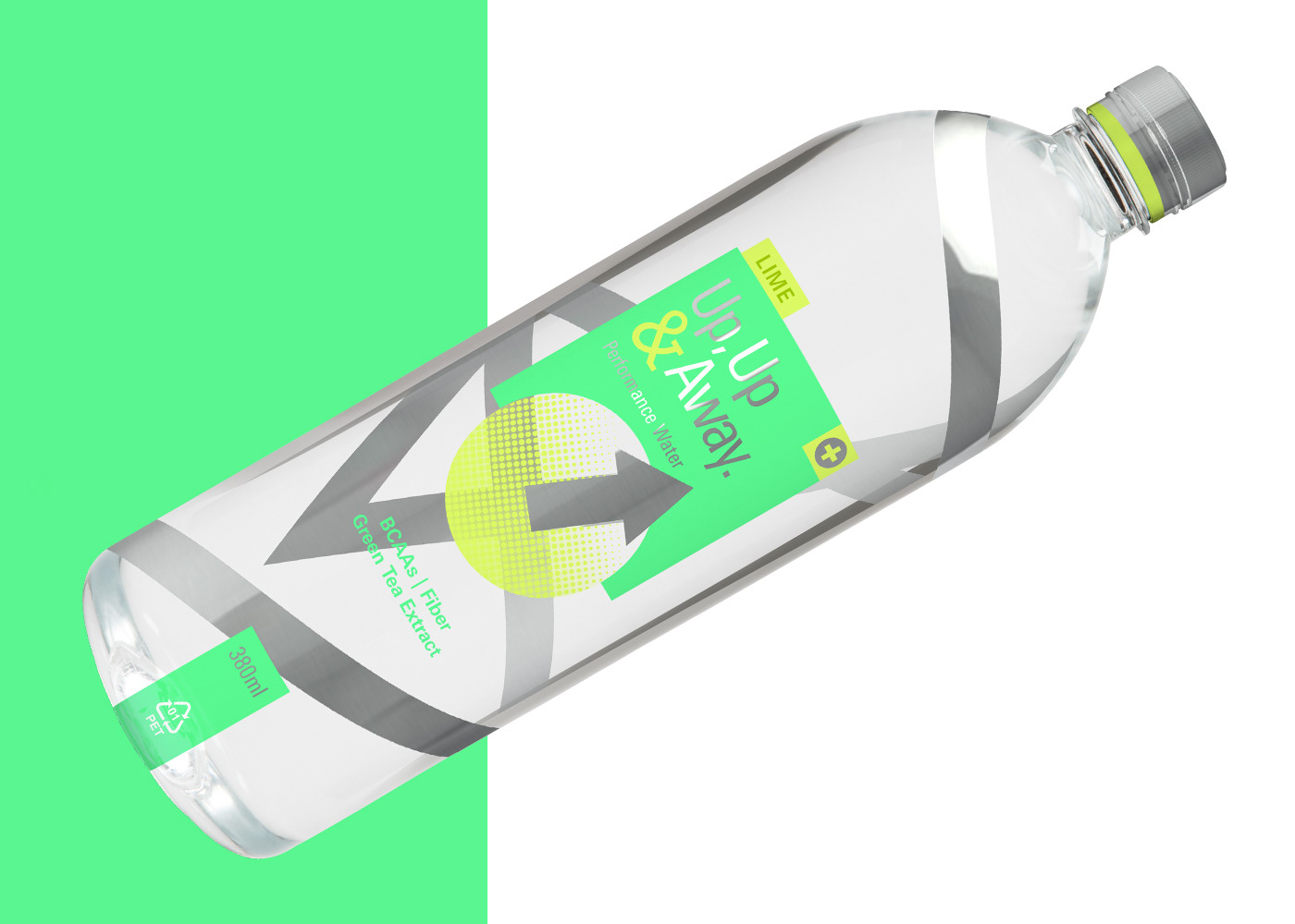
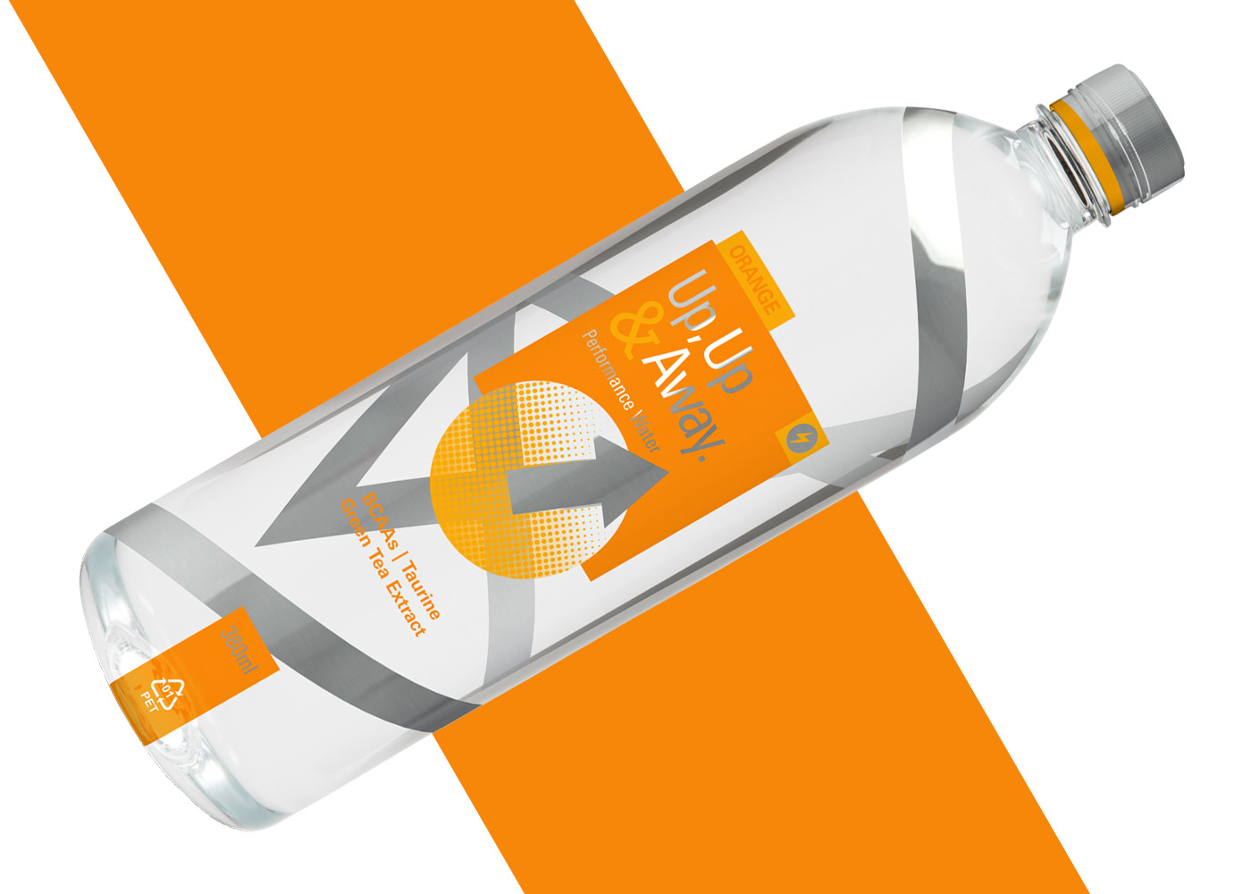
Whimsically named "Up, Up & Away.", this performance water product offers busy people on the go with nutritional support during mornings and times of relaxation & activity. The main differentiator for this product within it's market segment is that it provides ingredients not found in similar products which support everyday activities, while containing low sugar levels.
The design is a minimal one, the chrome finish arrow and line which winds it way around the bottle provides a sense of motion and gives perspective and depth to the package, while providing a premium look to the product. Colour coded by flavour & purpose, the analogous palette works harmoniously with the silver/chrome elements to give a sense of freshness and health. Use of silver in conjunction with a colour coded portion extends to the screw cap portion as well, aligning it with the overall look while also providing quick identification.
The font family used, Linotype Univers, was chosen for its clean humanist form which supports and extends on the simple elegance of the design elements. The ampersand then becomes a point of difference, with the use of the slab serif font Memphis.
With a strong focus on the use of simple geometric shapes and playful use of perspective and depth that extends on the amusing naming convention, together with the prominent placement of a dot pattern texture to add depth and detail to the design, this product is sure to grab attention on store shelves.